
There is a lot more to email than automation and segmentation (even though we are HUGE fans of both). One crucial part of email marketing that we haven’t talked about much is email design.
A good email design will help you present a lot of information in an easily digestible way, improve your click-through rates, and maximize your email marketing ROI. Here are 14 email design best practices to implement in your email campaigns.
Responsiveness is Mandatory
Email designs need to be mobile-friendly. This is nonnegotiable. Did you know that more people check their email on their phones than on desktops?
Most modern email service providers come with pre-built email templates that are mobile responsive. But if you’re designing your layout from scratch, here are some design tips for creating a responsive email:
- Stick with a single column.
- Keep your subject lines short.
- Utilize preheaders.
- Use media queries and CSS to adjust for different screen sizes
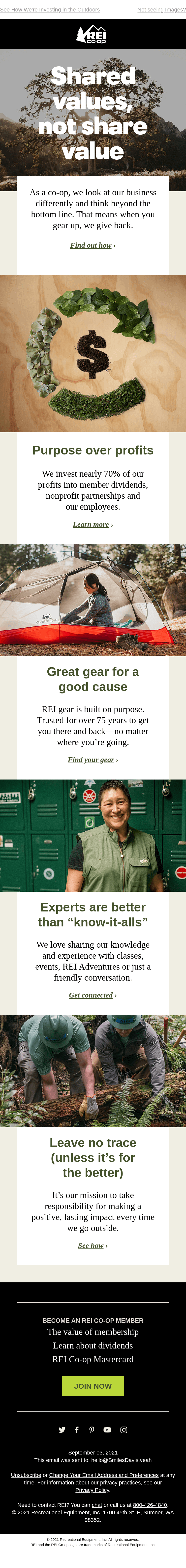
This email layout from REI is excellent because it essentially looks the same on desktop and mobile devices. The one-column layout is a much simpler approach than a multi-column layout that needs to “stack” on smaller screens.
White Space is Your Friend
White space is the use of blank space in designs. Without enough white space, your emails will look cluttered and confusing. White space also helps with accessibility because it increases legibility.
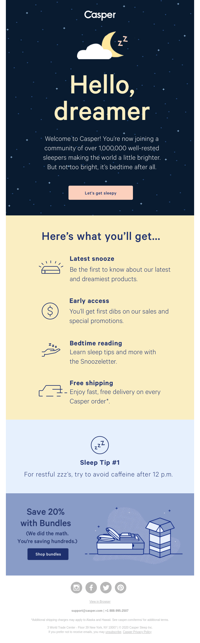
This email from Casper uses white space very well (notice that white space doesn’t have to be white). The spacing lets the text and icons breathe, making it easy to scan and find vital information.
Incorporate Your Brand
Your emails and website don’t have to look the same, but they should both incorporate your brand. The easiest way to do this is to ensure your email includes your logo, brand colors and fonts.
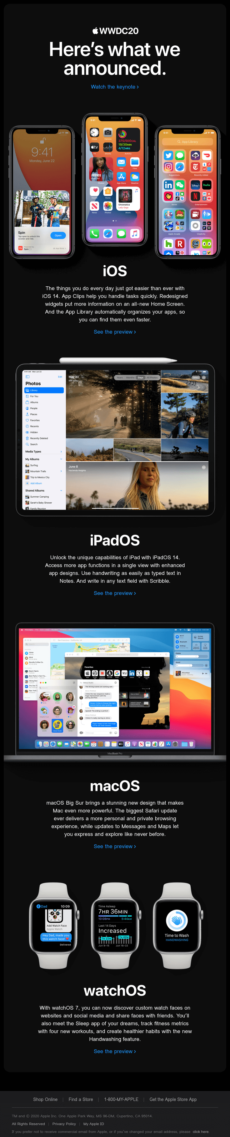
Apple has excellent branding that they incorporate everywhere in their marketing material — on their website, in their ads and in their emails. As soon as you open this email, you know it’s from Apple, thanks to their unmistakable fonts and color palette.
Make CTAs Easy to Find
A call to action (or CTA) is a design element intended to prompt an action. In ecommerce, the action is usually something like “Buy Now” or “Shop Now.” In your emails, your CTA buttons should be super easy to find. If people struggle to find your CTA, your click-through rates are going to suffer.
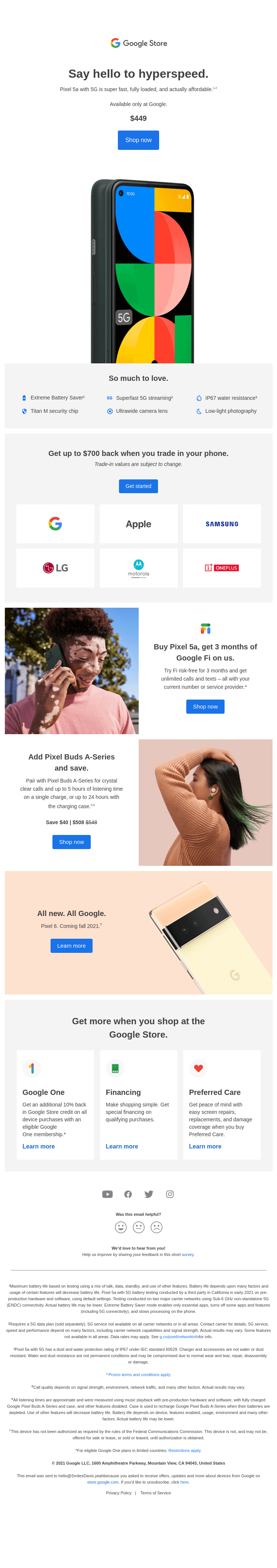
It is impossible to miss the CTA in this email from Google. It is very clear that they want you to “shop now.”
Remember Your Other Links
While your email should focus on a clear CTA, you will probably want to include a few other links as well. This is an excellent opportunity to incorporate your brand colors. You should also be mindful of how many links you have. Too many, and you might confuse your audience. Too few, and your audience won’t know what they should do after opening an email.
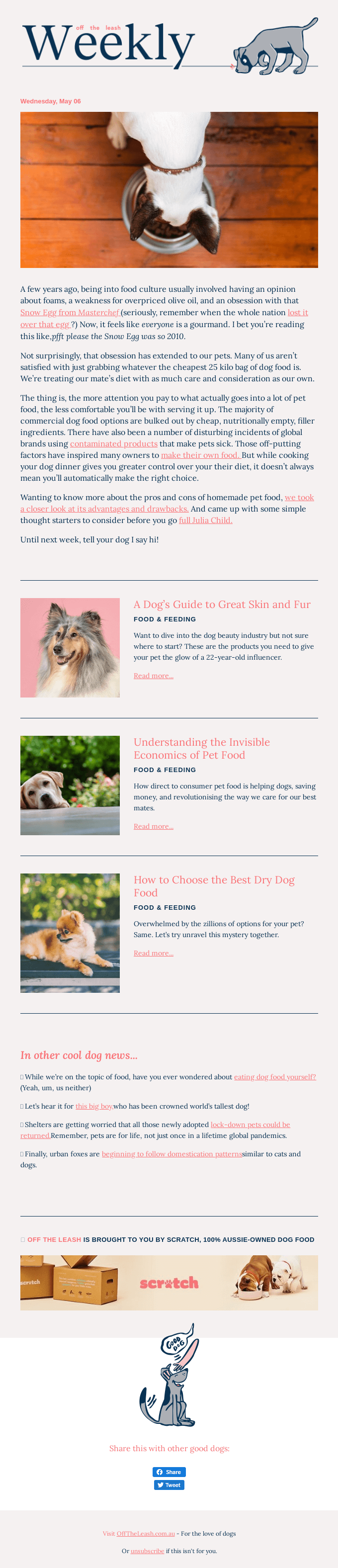
This email from Off the Leash is full of links without being overcrowded. They also use their brand colors which make the links pop off the page.
Use Personalization
Personalization could be as simple as using a person’s name in the subject line or as complex as summarizing someone’s shopping habits using information from your database. Either way, you should incorporate personalization into your email content.
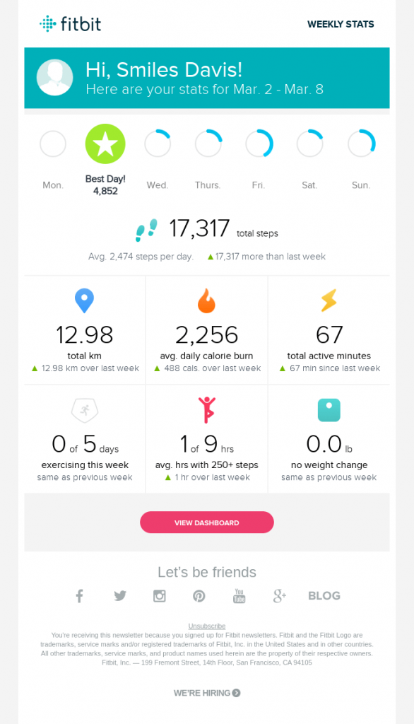
This Fitbit email is an exceptional example of personalization. Not only is this information fun for the subscriber to review, but it also does a great job of showing the value the product provides the customer.
Implement Dynamic Content
Dynamic content is like personalization on steroids. You can use dynamic content to change what information you show a subscriber based on the information you have on them. For example, if you know a subscriber’s gender based on their shopping habits, you can only show them clothing from your menswear line.
This email from HBO is brilliant because the main image changes based on what shows you’ve been watching.
Test Videos to Increase Engagement
Videos are a great way to way to enhance the user experience and increase engagement. But we suggest testing this out with your target audience because not every demographic responds well to videos.
If your videos aren’t getting through spam filters after A/B testing, try out animations or GIFs, which can have the same effect.
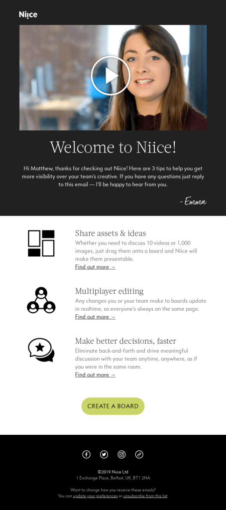
This email from Niice includes a video in the header area that walks users through their product. This is a great way to provide a personal connection, develop trust and demonstrate authority.
Strive for ADA Compliance
Accessibility is essential with everything you do on the web. You want to make sure that people with reading or visual difficulties can still digest the information in your emails. We mentioned that plenty of white space could be helpful. You should also make sure to include alt text for all of your images — especially text-heavy images like infographics.
Another critical element for accessibility is coloring. You want to make sure there is enough contrast between your font and background colors. For example, don’t use a black background with a dark gray font.
Use Supported Fonts
You should always use web fonts in your email copy. Google Fonts is a great resource for finding free web fonts. Plus, since the fonts are from Google, you know they’ll work well in Gmail.
If a subscriber’s email client does not support web fonts, you can assign fallback fonts to your body copy. Always use a web-safe font for your fallback. Here is a list of the best web-safe fonts for HTML and CSS from W3 Schools:
- Arial (sans-serif)
- Verdana (sans-serif)
- Helvetica (sans-serif)
- Tahoma (sans-serif)
- Trebuchet MS (sans-serif)
- Times New Roman (serif)
- Georgia (serif)
- Garamond (serif)
- Courier New (monospace)
- Brush Script MT (cursive)
Make Your Subject Lines Stand Out
Optimizing your email subject lines is the number one way to improve your email open rates. While this isn’t technically part of your email design, it needs to be considered if you want to send the best email possible.
Our favorite way to make subject lines stand out is to use emojis. They add a splash of color to the inbox and add some playfulness to your messages.
Don’t Ignore Your Preheader
You also need to optimize your preheader text. We wrote a whole blog post about preheaders, so check that out if you don’t know what we’re talking about.
Don’t Neglect Your Footer
Footers are often an afterthought on websites and emails and frankly, that is a huge mistake. Your email footer is the only area of your email that remains the same from email to email, so you better make it as powerful as possible.
In addition to required information like company name, contact information and an unsubscribe link, also consider including:
- Social media icons
- Social proof (like a review)
- A “thank you” from your company founder
- Links to important web pages (like FAQs, contact, etc.)
- Referral links
Consider Dark Mode
Dark mode is becoming the viewing style of choice for many people — so make sure your emails look good on a light and dark background. For more information on developing for dark mode, check out this article from 99designs.
So there you have it — 14 email design best practices that will help make your emails gorgeous on all devices. While you can try to design an email template from scratch, most email service providers have some basic templates to get you started. Once you’re ready for more advanced ecommerce features like personalization or dynamic content, talk to the experts today!