There’s nothing more frustrating than an almost-sale. A transaction that nearly happened, but then… poof. Nothing. Visitor clicks “X” and leaves your site without making a purchase.
Abandoned carts are maddening — but they’re not rare. According to Statista, more than 88% of all carts are abandoned. On an industry-specific level, consumers kick automotive carts to the curb more often than they abandon retail carts. Still, on average, fewer than 12% of online window shoppers make it to the checkout.
Thankfully, abandoned cart emails can help you woo undecided consumers. According to experienced marketers and influencers, more than 10% of cart abandoners return and complete checkout after receiving a well-constructed abandoned cart email.
We’ll begin this post with a closer look at cart abandonment — and at the reasons for a high abandonment rate. Then, we’ll examine 12 stellar abandoned cart emails. Finally, we’ll talk strategy, and we’ll show you how to create an effective abandoned cart email of your own. Let’s dive in.
Why Do Customers Abandon Carts Anyway?
Really successful abandoned cart emails don’t appear at random. Instead, they’re the result of careful analysis and strategic thinking. Before you begin to write boilerplate, consider the following:
- Why do your site visitors decide not to purchase?
- When do your site visitors decide to abandon carts?
If you’re not sure about the answer to the first question, the answer to the second question may provide a clue. If, for instance, visitors abandon carts when they’re faced with shipping options, you might have an issue with unexpected shipping costs.
Top Reasons for Ecommerce Cart Abandonment
Let’s delve into unexpected shipping costs — and a few other things — in more detail before we move on. See, the main reasons for cart abandonment remain the same regardless of industry. Here they are:
- Unexpected shipping charges: Customers don’t like shipping fees. They really don’t appreciate shipping charges added at the last minute. A full 60% of shoppers walk away from ecommerce stores in response to unexpected shipping fees.
- Confusing checkout process: Don’t make visitors jump through hoops to check out. In fact, make it as simple as possible for people to enter address and credit card information. If you don’t, 28% of your visitors won’t buy.
- Compulsory account creation: Most consumers want to purchase and leave, rather than make an account. If you make membership compulsory, your cart abandonment rate will go up and you’ll lose roughly 37% of your sales.
TL;DR: To reduce your abandoned cart percentage, be upfront about shipping fees (knock them on the head completely if you can), simplify your checkout and offer a guest checkout option.
12 Effective Abandoned Cart Email Examples
Need an abandoned cart email that really works for your ecommerce business? Well, we’ve got you covered. Here are 12 irresistible emails to give you inspiration.
#1 Google Ads
Why It Works
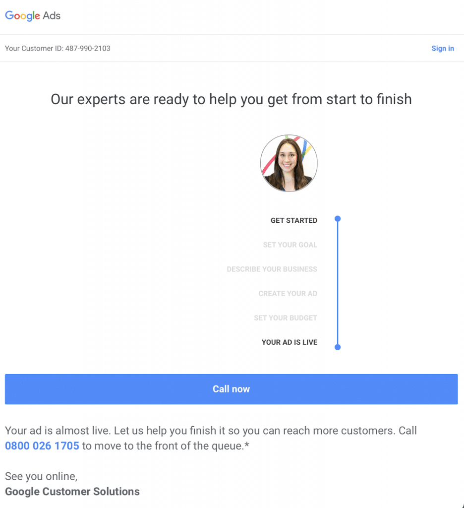
Strictly speaking, this isn’t a retail-centric abandoned cart email. It’s still worth looking at, though — primarily because of the “purchase journey” graphic shown on the right. It’s visually simple and it makes ad creation easy to understand. If you sell a service — design, hosting, finance etc — this kind of minimalistic purpose-driven abandoned cart email could work wonders.
#2 Zooplus
Why It Works
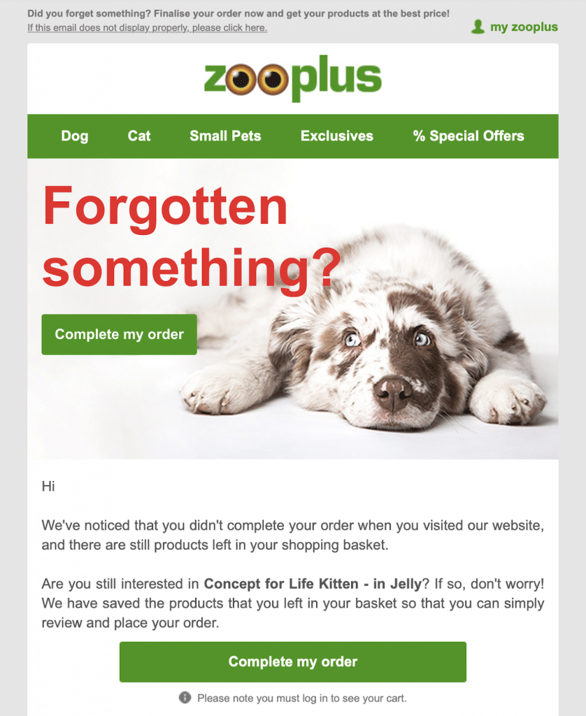
Who can resist puppy dog eyes? Answer: not too many people. Zooplus makes good use of imagery in this relatively short abandoned cart email. The glum-looking doggie at the top reminds the recipient of their pet ownership duties, and two “complete my order” buttons make a return to checkout easy. Zooplus doesn’t include a picture of the abandoned item, but it does mention the product.
#3 Debenhams
Why It Works
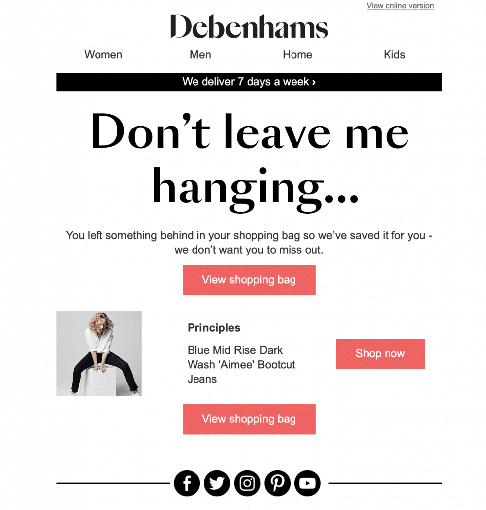
Debenhams gets personal with the “don’t leave me hanging” subject line. They don’t want the recipient to “miss out” — in other words, they care. With that in mind, they’ve generously saved the visitor’s shopping bag. Isn’t that conscientious? The recipient gets a visual reminder of the product below — plus two links to the checkout and one additional link to the Debenhams online store. One more thing — they deliver seven days a week.
#4 Thompson and Morgan
Why It Works
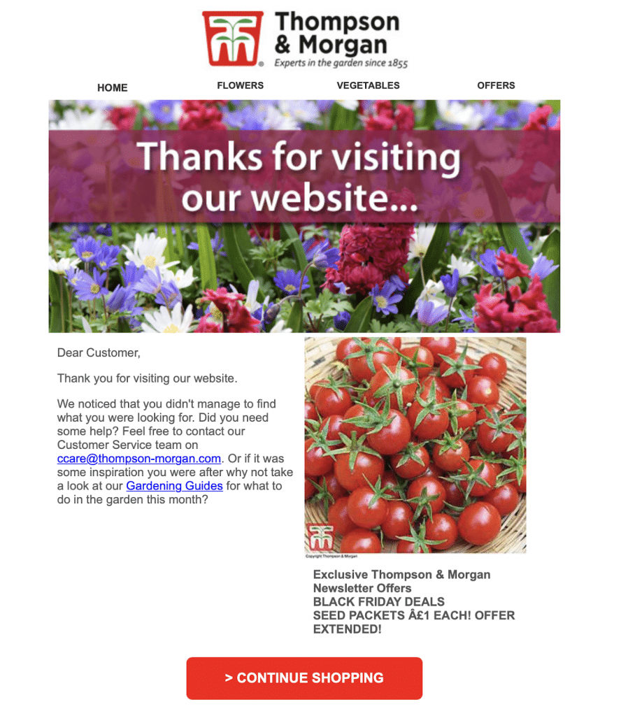
British gardening company Thompson and Morgan knows its customers well. Gardeners love healthy-looking flowers and plump veggies, and they’ve made the most of both in this colorful cart reminder email. The T&M team offers assistance straight away via an obvious customer service email link. You also get a Gardening Guides link and a big red “Continue Shopping” button to tempt you back to the website.
#5 Stride
Why It Works
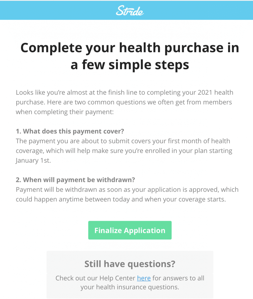
Health insurance is important — and in this email, healthcare recommendation company Stride strikes a sympathetic and encouraging tone. The team answers two common FAQs right off the bat, removing a couple of barriers to purchase. Recipients can visit the help center to learn more, or they can click on the soothing blue-green “Finalize Application” button to get squared away on the spot.
#6 Mail Order Trees
Why It Works
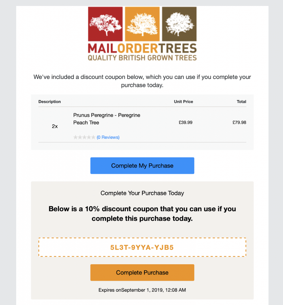
Simple name; simple concept. This UK-based tree supplier begins with a reminder of the recipient’s products and total order value, and then gets straight to the point with a 10%-off discount code. It’s simple, and it gets the job done. They add two “Complete My Purchase” buttons in two different colors to guide visitors right back to the online checkout.
#7 Wickes
Why It Works
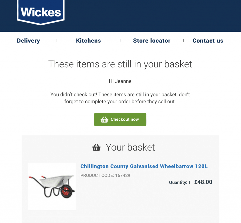
Wickes goes for the “whoops — you forgot!” approach in this time-tested abandoned cart email. The Wickes team also kindles FOMO by implying that if you don’t come back and purchase right away, your product might sell out. You get a nice big picture of the product you abandoned, and a clear green “Checkout now” button — complete with basket symbol — to encourage a purchase.
#8 M&S
Why It Works
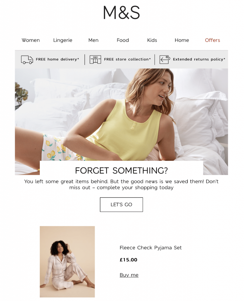
The header of this M&S abandoned cart email includes links to every department on its site. Just below that, you see three compelling reasons to purchase: free home delivery, free store collection and an extended return policy. In other words, making a purchase couldn’t be more convenient. M&S appeals to the recipient’s ego by declaring the abandoned cart content “great,” and then it embeds a simple and enthusiastic “Let’s Go” button.
#9 Capital One
Why It Works
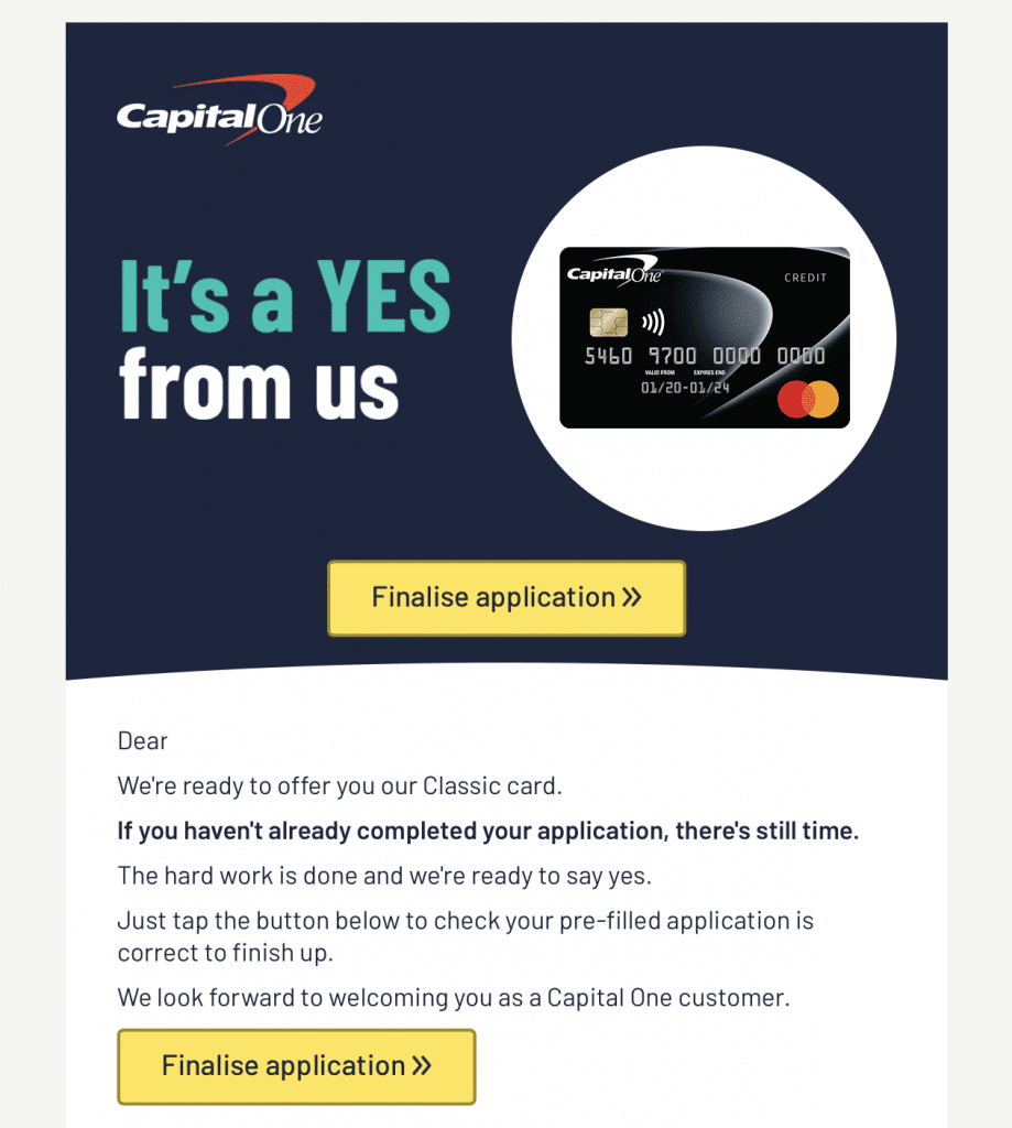
This one generates a buzz with a big “yes,” right at the top. The word yes is thrilling: it opens the door to new possibilities — in this case, with a credit card. There’s a picture of the credit card next to the opening phrase, and an obvious yellow “Finalise application” button below. Still not convinced? Capital One continues with a short piece of marketing content, which implies that most of the hard work is done and that the recipient simply needs to sign on the dotted line. One confident final line (social proof in action) — “we look forward to welcoming you as a Capital One customer” — and another yellow CTA button ties a bow around this email.
#10 Glossier
Why It Works
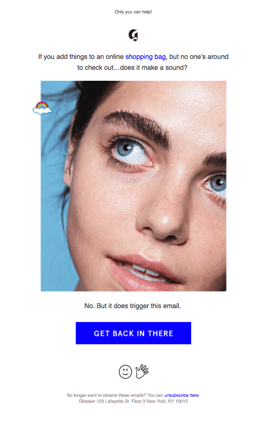
This abandoned cart email is short, snappy and a little sassy. Glossier has taken the time to understand its consumer demographic: young — or young at heart, confident and playful. The Glossier marketing team uses humor to encourage a repeat visit. Big sister is watching, but she’s not so bad. She just wants you to come back and get that tube of cloud paint you’ve been pondering over for the past three days. No sweat, just “get back in there.”
#11 Virgin Atlantic

Why It Works
Most people enjoy traveling. Itineraries suggest adventure, and Virgin Atlantic uses that to its advantage in this email. Boom: you get an exciting after-dark cityscape header, followed by an itinerary. “You’re so close…” says the subhead. You could jet off into that twinkly urban dreamscape if you complete your purchase — and the “Go to my basket” button at the top makes it all too easy.
#12 Bare Minerals
Why It Works
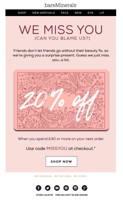
Bare Minerals appeals to emotion in this pink — and unmistakably girly — abandoned cart email. A realistic-looking money-off coupon graphic takes up most of the email real estate. That’s Bare Minerals’ gift to the recipient — because they miss the cart abandoner so much. It’s a generous discount, to be sure. The email ends with a contrasting white “SHOP NOW” button at the bottom.
Top Cart Abandonment Email Tips
The open rate for shopping cart abandonment emails hovers around 45%. Feeling inspired and ready to create your own abandoned cart email? Fab! Here are five tips and tactics to hone your strategy:
Write an Email Campaign Series
Instead of a single abandoned cart email, write a series. Send the first email in your email sequence within a day, the next within three days, the next after about a week and your final email after two weeks.
Personalization and Segmentation
Use AI-based automation to create personalized emails and track metrics afterward. Appeal to emotion and suggest alternative products based on your visitor’s browsing history.
Hot Email Marketing Tricks: Offer a Coupon
Everyone loves a discount. Emailed coupons are extremely effective — especially when they’re attached to cart recovery emails. Every 10% off makes a difference.
Create a Great Subject Line
Make sure you create a really compelling subject line. Many recipients have limited time to read emails, so they’ll pick the most interesting and ignore the rest. Intriguing email subject lines pull readers in, so don’t rush.
Include Clickable Buttons
Forget in-text links — use brightly colored buttons to improve email click-through rate.
Email Marketing Templates 101: Abandoned Cart
Alright — time for a practical lesson. Here’s how to rival Amazon and create a great abandoned cart email in five steps:
- If possible, open with a personalized greeting — “Hello, Annie” for instance. If you don’t know your visitor’s name, get chummy — “Hi there, friend” or “Hello, you.” People respond to a friendly vibe.
- Remind your visitor what they abandoned. Show them a picture of their cart content to tempt them to go back and complete the purchase.
- Use regular email marketing tactics. This is a conversion opportunity — but it’s also a chance to promote add-on sales.
- Be helpful. Maybe your visitor got confused. Perhaps they weren’t sure about your company. A helpful human “voice” could sway them, so offer assistance.
- Link to the cart. Include a bold button with an embedded link to your recipient’s cart.
- Don’t send from a no-reply address. Don’t make it difficult for visitors to ask questions. Stay away from unmonitored email addresses — instead, make yourself available.
Let’s see that list in action, shall we? You’re a fashion retailer, and one of your repeat customers, Stella, has just abandoned a dress in her online shopping cart:
Hello there, Stella,
You left something fab in your cart just now. Remember this?
[INSERT PIC OF ITEM]
Way to rock this season’s signature style. If you have any questions or need help, we’re here — and don’t forget, you get free shipping on all orders over $50.
All the best,
Zara from Fashion Direct
P.S. Here’s a 10% off coupon to make you smile.
[INSERT CHECKOUT LINK]
[INSERT COUPON GRAPHIC]
Where To Find the Best Abandoned Cart Email Templates
Some people prefer ready-made abandoned cart email templates to DIY abandoned cart emails, and that’s okay. Most ecommerce platforms — Shopify and Woocommerce for example — have a range of pre-written reminder emails available. Messaging and email marketing services like Mailchimp also offer templates for online retailers.
You can modify abandoned cart email templates to suit your needs and schedule them appropriately via your dashboard. Don’t forget to add an unsubscribe link at the bottom to ensure you comply with national and international spam laws.
Cart Abandonment: The Wrap
Abandoned carts are an inevitable reality in online retail — but that doesn’t mean you can’t improve your conversion rate. A well-written abandoned checkout email series can help you win back more than 10% of cart abandoners, recover revenue and boost your bottom line. Before you begin writing, eliminate any obvious reasons for cart abandonment, and then focus on personalization and segmentation for best results. Oh — and don’t forget a coupon.
![The Importance of Cart Abandonment Emails [with 12 Amazing Examples]](https://quantumlifecyclemarketing.com/wp-content/uploads/2021/07/1073885_Cart-Abandonment-Blog-Header-2_052012.jpg)